Sweating the UI & UX details in Close.io: Emails & Email Addresses
My blog post on the Close.io blog was pretty popular (18,000 pageviews & lots of HN comments) so I wanted to cross-post it here:
Sweating the UI & UX details in Close.io: Emails & Email Addresses
We like to think of our sales software, Close.io, as having a lot of magic under the hood. When we do our jobs successfully, our users may not even notice, but their lives will be made a little easier. We try to make features just work without requiring users to think too much, even if that adds complexity in code.
Here are a few examples:
1) Entering contact details
Most CRM and address book software make you enter your contacts’ phone numbers, email addresses, and URLs in specifically chosen separate fields per data type.
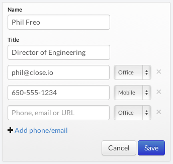
We realized this sucked and now give you a contact form like this:

You shouldn’t have to make a choice for each phone number, email address, or URL you enter for a contact. We just give you one place to enter all their contact information and we figure out what type of data is what. (Then you can 1-click call or email this person).
Is taking a string and deciding if it’s either a phone number, email address, or URL particularly hard? No, but it’s “hard enough” that most CRMs and address books don’t do it, and we wanted to take the extra time to make our users’ lives easier, even if they don’t notice it.
2) Pasting contact email address
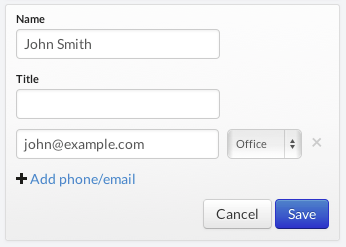
A recent iteration on the contact form was improving a fairly common scenario where you had email from somebody and wanted to save their email address onto a contact. Many email clients give you a string like: “John Smith” <[email protected]> when you copy the address. Originally if you tried to enter that as an email address in Close.io it would complain about it not being in the simple email format like [email protected].
Now, when you paste that text into the email field we’ll automatically pull out the email address part and fill in the contact’s name field if it’s blank:

Again — not particularly difficult, but something most software doesn’t do. This is the type of magic that many users won’t even notice or think twice about, but helping users avoid validation error messages is as much of a benefit as any new feature you could make.
3) Zero configuration email sending
The first few times you try to send email in Close.io, it’s as simple as clicking the big “Email” button on a sales lead, typing a message or choosing a template, and clicking send. We already know your email address when you signed up, and we use our own Mailgun account to send email as/from you, so that it just works.
We do put a cap on the number of emails you can send without entering your own SMTP credentials (which will also give you better email deliverability), but for users just checking out Close.io, it’s one less configuration step in the beginning.
4) Magic email tracking from all your email clients
Forget having to BCC/Foward all emails with sales prospects to some random CRM email address. Plug your IMAP credentials once into Close.io and we automatically track your sent and received sales emails regardless of how/where you send them.
Much more to do…
We have a long list of other little UI/UX improvements we need to make, but hopefully this was enough to encourage you to think twice about the tools you’re using and discover opportunities for improvement.
And if you’re a software developer… be sure to sweat the details – it takes more time, but it makes for happier users!
We’d love to hear your reactions… follow @closeio and @philfreo
– Phil Freo